Showing posts with label Up-close. Show all posts

Up-Close with the unknown promotional Matchbox International Brush Fire Truck, by David Tilley...


Our favorite DLMer David Tilley is back, this time taking at look at the still-in-limbo Matchbox 60th Anniversary International Brush Truck.  Leave it to DT to be the first to rip one open...

(And just in case, there are still a handful that got out before Mattel removed them from stores.  Find them here...)

(Enjoy.)


Well, this is a model that has been confusing collectors for the better part of 2013.  When it was first announced early this year that there was going to be a special 60th Anniversary model this year, many were curious as to what it could be, and where it would end up.  Then an example appeared on eBay, followed by a second one, and a few more.  These were from the same seller, and as it turned out, they were accidentally put out in one of the Mattel stores.  Then things went quiet. 
 
Recently, a bunch have appeared on eBay again, and I was one of the people grabbing them.  It sounds like this too could have been an accidental store release, as there is a rumbling that they could be used by their original recipient after all.  Or they could just be put back into storage (a library item as Mattel calls it).  Either way, I am glad enough to have an example now regardless of the outcome.


This is the biggest and best example of the 60th Anniversary celebrations that Matchbox has done.  The package comes inside a Matchbox logoed clamshell (the Matchbox logo is on the back).


When you open the clamshell, you find that the package is also a very thick card. 


With the back receiving some love too.  They did put a lot of effort into this model.  They really should have done the entire series like this.
 
But this is me, and this sort of stuff is not the type of stuff that I have in my collection.


So take one last look, as this model is about to be liberated....


 Now that is better.  One loose model.  To begin with I start with the usual 3/4 views front and rear.  This model does look really good in the orange, black and white livery, with just a touch of gold and chrome to finish it off.


As you may notice, one side does feature the 60th Anniversary logo that all models in the special series (and 9/10-packs too) received for the year.  But I have to admit it does not really detract from the overall look.  It does sort of fit in, especially with the color combination.  The rest of the livery is very simple and tidy.


It does work well with the color breaks in various parts.


Also, as a bonus we get a metal base on this model.  It is the only metal base release of the year, and as such makes the model pretty hefty.


The front features a few little light touches too.


As does the rear.


If you were wondering, this is pretty much identical to the last time the model received additional printing (and metal base) in the Lesney Edition.  To date, these are the only double diecast or premium models on this casting.


But I have to say, this one looks a lot nicer to me.  I was never as keen on the blue/yellow combination.
 
So there you have it.  One “library” issue, that may end up appearing in a store or in a promotion at some time in the possible maybe perhaps conceivable future. 


It does look good in larger pictures too....

Up-Close with the Matchbox 2013 Everett Marshall Charity Golf Tournament Exclusive Ford F-550 Super Duty Fire Truck, by David Tilley...


Our Lamley partner David Tilley is now back home in the UK, and had a chance to photograph the latest Everett Marshall Golf Tournament Exclusive.  Here is another in his Up-Close series, and be sure to read to the end to find out how you can get one of these beauties and at the same time donate to a very valuable cause.

(Thanks David.)


Up close with the Ford F-500 Super Duty Golf Tournament Promotional, by David Tilley
 
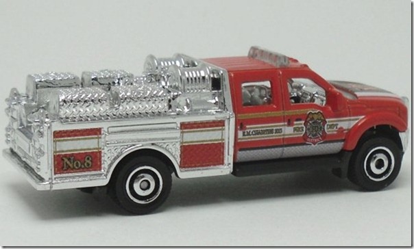
Today I thought I would show you the latest Matchbox promotion to come direct from the factory in Thailand.  Everett Marshall lives in Newfield, New Jersey, and has a long association with the Matchbox brand.  Anyone who is a seasoned collector will know of the yellow Buick LeSabre from 1989 that adorns his name on the roof.  Well in recent years, he has become associated with “The Burn Foundation” in USA, and each year in August they run a charity golf tournament in New Jersey.  As part of the proceedings, Everett commissions a code 1 Mattel produced vehicle for the event.  This year, the tournament takes place on August 9 at “The White Oaks Country Club” in NJ and to accompany him this time is this beautiful Ford F-550 Super Duty.


This is the 8th Annual Tournament he has overseen, and (apart from the 6th Annual event where the Hazard Squad was produced in a run of 400) this model has been produced in a limited run of 300 examples.  Each one is screwed into a plexi-glass case.


But this is me we are talking about, and so this model has to come out. 


So let us start with the classic 3/4 views.  I always start like that.


The model is red with a chrome rear section.  This is the first time the rear has ben chromed, and it really makes a difference to the model.


The sides sport red and white striping and the usual FD crest, alongside the E.M. Charities 2013 insignia, and No. 8 at the end (signifying the 8th tournament).  This is also the first time the rear section has seen tampo printing too.


The hood shows off the 8th Annual Tournament logo on a black and gold background.  Very nice. 


It is difficult to see on the base, but the etched date of production is F28.  This means they were produced in mid-July 2013 at the factory.  Talk about last minute production as they were cutting it really close to getting them over to Everett before the tournament began.


So we are treated to a lovely promotion, which helps a very good charity too.  It is worthwhile getting an example, and donating to help people who have been affected by burns.

For anyone who wants to obtain an example of the Ford Mimi Pumper, there are really only 2 ways to properly do it.  The easiest way is to send an email to Everett at mbroad@aol.com and ask if he still has any available.  Of course these are charity models, and as such there is a minimum donation of $50 to get the model.  Feel free to donate as much as you can.  The work the Burns Foundation does is truly worthwhile.  He still has odd examples of some of the previous ones, with the 6th Annual Hazard Squad and 7th Annual Seagrave still having a couple of examples left too.  The other; well it is simple.  Be there, The White Oaks Country Club, 2951 Dutch Mill Road, Newfield, New Jersey, on August 9th with your golf clubs and join in the tournament. 

Matchbox Monday: "Up close with apparently a 2-tale bus" by David Tilley...

It is still Matchbox Monday, and we thought it would be appropriate to borrow from Mr. Tilley, who completed another of his "Up Close" features, this time on the just-hitting-stores Matchbox Two Story Bus.  

As always, Matchbox Monday is brought to you by MVE Collectibles.  Be sure to check out their store for the latest Matchbox, along with many other models from various brands like M2, Greenlight, and Johnny Lightning.  Very much worth a perusal...

On with DT's review:


"A 2-Tale Bus"

I am saying that because of the spelling on the naming of the bus. They have called this bus a "Two Story Bus". A story is a tale that you tell. In USA a story can mean something on 2 levels, but as this is supposedly a depiction of a British Double Decker Bus, I would have given this the British spelling too. In Britain something on 2 levels would be a "Two Storey" with an added "e" in the word. Am I being picky? Yup! It is not incorrect per se, but if you depict something British you should go with the British spelling I think. After all, it has the steering wheel on the right, as they do in Britain, so they were obviously going for something British with it. Plus, the ROW packaging is classing it as a London Bus rather than the baseplate name. So everything is pointing to something very British with it, yet they use the US spelling. But anyway, that aside, I actually quite like this.


It fits in well with the older London Busses we have seen from Matchbox in the past. Of course had the wheels been smaller they would have suited better. 


The front end shows a good representation of the types of busses we see around the UK nowadays. It is a modern design with the large window area. It also looks pretty realistic, and I would not be able to tell you any bus names, and I am sure many will not either. It also contains an interior, which the Routemaster before it did not. That only had a spiral staircase at the back.


Again from the rear, the detailing is very good. This does look like the type of vehicle you would see on the roads nowadays.


They included a window in the roof. I am not sure why. Normal busses don't have them, and it is not to reduce weight as both parts are plastic anyway, so that is a little unnecessary. Perhaps they were just trying to break up the sparce roof area. 


The only part that is metal is the base. It is also unpainted (well zamac coated as they do nowadays). Had this model been done the other way round with the body parts made of metal and the base plastic I am sure many would have commented that it was a decent model. I am sure that more will dislike it purely because of the reversal of materials used for body and base. But as you all know, the metal vs plastic debate does not interest me. I am fine with the model this way round. The thing I am a little sad to see though is that because this is the debut version of the model I would have expected it to debut in traditional red. I do like that the upper and lower halves are still separate and so you can get a color break if needed, as has been basically traditional on London Busses since at least the 1972 Londoner (I don't bother with earlier stuff so do not know if they also did split bodies), but we should have seen a red debut. Plus, I also feel the side design should have been a more traditional sign look and possibly hinted at the Matchbox 60th Anniversary, much like the chase Routemaster did in the Anniversary range. It would have made it look better. So for me, those are the weak points in what I think is not actually a bad model.

But while I am here, what about a comparison size-wise with the Routemaster. It was said that this is also a large vehicle, but just how large?


It is actually just as long as the Routemaster is, and therefore fits in with the largest vehicles in the range. 


Height-wise, it is slightly lower than the Routemaster was.


The width is about the same, although with the mirrors on the side it does make it ever so slightly wider in total.

So there you go. Let the plastic bashing begin....

Matchbox Monday: David Tilley's Up-Close with the Mountain Adventure 5-pack...

Another in David Tilley's Up-Close series, this time looking at the new Mountain Adventure 5-pack, out in most overseas locations, and due in about a month in the US:


As it is a Matchbox Monday, it is time for a look at another of the recent Matchbox 5-packs.  This should be out in USA pretty soon, but has already made its way over to the UK.  This is called Mountain Adventure, and contains 5 vehicles with an adventure theme to them.


The first model is the Cliff Hanger.  I don’t know why, but I really love this little model.  It is one of my favorite generic castings in the current Matchbox database.  I always look forward to each and every version (and variation) I can find.  For those who look for this type of thing, there is a wheel variation on this model.  So far it has only been found in Canada, and only in 10-packs.  The orange wheels are chrome.  Something for me to try and hunt down myself, but for now there is the normal version in the 5-pack.  This version is actually pretty nice.  The model is a nice dark metallic blue with an orange interior and gray base.  Orange interiors are normally a little too bright, but this time they do not seem really out of place.  The lighting on the camera does seem to brighten up the orange, as it is actually quite a dull shade.  The model sports a nice simple hood print of “VEH ID 1” in a black box with gold pin striping. 


I love the little touches, like the “Tow Rope” and arrow at the front.  It shows the guys who design these models do seem to think what they are doing sometimes.  There is also a black/white roll bar print.  I know many are not keen on this model in general, but I love it, and I love this version too.


The 2nd vehicle is the Jungle Adventure.  It tells you behind the last side window.  This model is orange with Mountain Cobra Tours on the side.


It is not easy to read in the photo but under the tours writing the sub-text is “It Will Only Sting a Little!”  With a snakeskin style tampo print, it looks like some effort has been made with tampo printing.  Many Jungle Crawlers have been rather tampo-driven and can be rather hit or miss.  This I think is one of the nicer ones.  The yellow windows actually appear to look worse in the photo.  In general you don’t seem to notice them. 


Third up, according to the numbers (this time behind the door space) is the MBX 4x4.  There is not that much to say about this one.  I have not been the biggest fan of this model in general, although it is much nicer than the Off Road Rider that debuted a few years before this one.  It is the first time we have seen it in white, and the simple side design actually works pretty well.  Out of all the variations I have of this model, I think this is actually one of the nicest ones.  Simple and effective.  Shame it didn’t have a mud splatter print on it.  I mean, it is white and used in mountains.  It is going to get muddy.


Vehicle ID 4 is the only licensed vehicle in the set.  The 1968 Toyota Land Cruiser in metallic burgundy.  I love this color, but with a lack of front detailing as we have seen on many examples it does lose a little something.  The side design is nice though.


It is actually impossible to read the sub-text underneath the Bear Tours print though.  I tried taking a photo and zooming right in on the print, but it is just all too small to be readable.  I like the idea of the side boxes (one with animal feed, and the other for first aid).  The bear, being partly silver print and partly white print actually gives the impression of depth to the picture, and I have to admit to being very impressed to how it looks.  It is extremely realistic.  Again we have yellow windows which look worse in photo than they do in real life.  I am not a huge fan of yellow windows in general, but in both cases for models in this pack, they do not look that bad in person.  In normal viewing without loads of light flooding in through the rear of the model they look a lot less vivid.  Okay I would love to see this model in this same color scheme with front details and a white roof, but that would not have worked in this set.  Maybe that could be an idea for a basic range model in the future.


Finally, as noted by the number on the bottom right hand corner, this is the 5th vehicle in the 5-pack (it is so nice of them to number them up for us).  Now if only I could remember what it is called.  Ah yes, they help us out with that too.  It is the Road Tripper.  Apparently this model is equipped with safety glass, according to the write up in the large arrow. 


There is quite a lot of tampo printing on the side of this model.  Yet they missed the door handles!  Doh!  But I actually quite like the printing on this model.  Compared to some of the previous Road Trippers we have had in the last year, I think this is one of the nicest ones.


Except this time the windows are really noticeable in quite a dark orange.  They really do stick out on this model.  Where windows are just windows on the other 2, on this they are also a part of the roof, and the spare wheel.  I think therefore this time they should have been perhaps a smoke color, so as not to be too garish.  Maybe some like things garish, but I suppose that is always a matter of taste. 
 
Overall, I actually quite like this pack.  As a group the models do not seem to gel together very well, but when you start pulling them apart and viewing them individually, they are actually quite decent models.  My first impression of the pack when I saw it in stores was not great, but once home and opened up I do believe this pack has grown on me.
 
You know what they say.  Don’t judge a book by its cover.  It is not an immediately nice pack, but it does grow on you.


Matchbox Monday: David Tilley's Up-Close with the Outdoor Sights 5-pack...

Last week DT profiled what most Matchbox collectors (including me) consider the best 5-pack of the year, the Police 5-pack.  He is back with another pack this week, the Outdoor Sights pack, which is out in most places except the US.

From DT:

Ok this week we do an up close with the Outdoor Sights 5-pack.  This is the second 5-pack of the year to include a trailer inside which I always feel is a great plus.  We start off with an old favorite.


The 1970 VW T2 Bus.  Sadly we are not seeing a basic range version of this model this year, which is a real shame as it is such a popular vehicle.  So this may be the only one we see this year.  Well I have to admit, this is a really nice version.  It comes in red with a “Camp Matchbox” logo on the side.  It is a very simple side tampo, and I think this works really well.  It could almost be a classic style livery, but still has enough of a modern twist to it to appeal to many people.


I know some like the front/rear tampo print on this model, but I do not mind the side printing only.  It looks pretty realistic.  I think this is probably my favorite model in the pack.


Next up we have the MBX Motorhome.  The yellow windows are not to my liking (thinking smoke would have been better), but that is the only small complaint against the model.  Although you cannot really go wrong with the side swirls.  Of course it would be nice to see some different side designs, but I am not one to complain about the swirls.  I do like them.  The shade of green is also really nice as well. 


It is nice to see a model that does not get much use.  The Ford F-series with raft makes a return after a 3 year absence.  Amazingly it still has the same sawblade wheels on it.  But I do like this model, and am always happy to see more versions of it.  It is a nice simple design again, and the logos on the side really work here.


What I like about both these 2 models are that parts of the models move.  The rear opens on the Motorhome, and the raft tips up on the Ford. 


Next up we see the Honda Ridgeline in black.  Again this model sports a rather simple side design, reminiscent of how it looked in 2011. 


It is there to pull the Travel Trailer which this year comes in white over orange. 


I like how these 2 go together.  I do enjoy seeing the trailer units in packs, and with only a few Hitch ‘n Haul sets appearing, these 5-packs are now the main source for finding these pairings. 
Related Posts Plugin for WordPress, Blogger...